By: Cecil Green
It’s easy to let personal bias take over during the design process because most times we do it subconsciously. As indicated by Designer Michael Bierut, it is imperative that we always consider the users’ needs above our own. This means asking the right questions, seeking disagreement, and collecting quantitative data.
“We tend to be distracted by the voices in our own
heads telling us what the design should look like.”
— Michael Bierut
The only way to validate design decisions is to test early and often; during testing, our users become co-designers who ultimately decide whether our application is a success or not. Failure at this stage is not only encouraged but required so that we can develop the best possible version of our application.
“Usability testing is the killing field of cherished
notions.”
— David Orr
User Personas
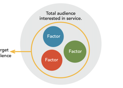
User personas were developed to identify and predict specific user behaviors and motivations. These profiles are loosely based on real people within our target audience and for the purposes of our initial prototype, we focused on the student (an incarcerated veteran) to drive feature prioritization. Incarcerated individuals like Steve will be using our software with the most constraints, so it’s important we factor in those constraints to ensure the user experience is consistent for all users. For instance, Steve, a 35-year-old veteran serving time in the Augusta State Prison, has never studied computer networks. Steve is a visual learner who needs to watch demos of basic system administration utilities by his instructor to solidify his learnings. He will need to hide the networks within the emulator to practice making configurations, and each of these functions must be possible without an internet connection. Other personas include Reclass Instructors and even individuals that are hoping to self-teach outside of the Reclass program. For these users, we provided clear usage instructions, custom configurations, and error messages.
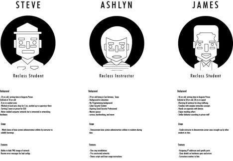
Though our main target users are incarcerated veterans, Covid-19 restrictions would not allow us to test such individuals, so we gathered a diverse group of participants to represent our user personas as closely as possible. For this stage of testing, we were limited to our immediate personal and professional networks. Participants came from backgrounds such as software engineering, architecture, data science, and chemical engineering, sixty percent of these individuals had no prior computer networks experience.
Looking forward we are hoping to expand the demographics of our participants to cover individuals without any higher education or those with non-traditional education and vocational training.
User Testing
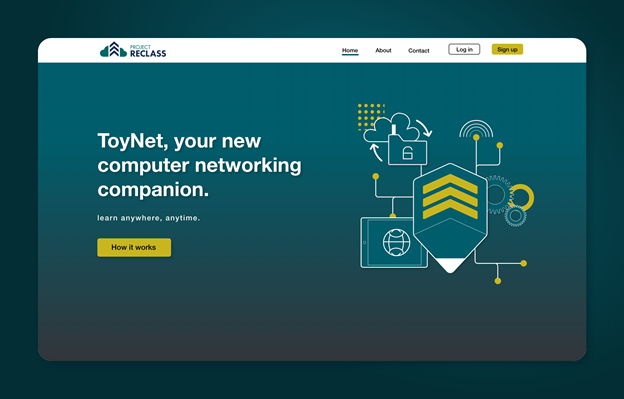
Following the design hand-off, the engineers and developers implemented the majority of the application interactions and specifications. The engineering team had built a fully functioning splash screen including a CTA button which led users to the emulator demo. While the emulator was only thirty percent complete, the major functions of each panel were operational. At this point, we had more than enough of the interface built out to start validating initial design assumptions.
The first round of testing focused on two main screens: the splash screen and the emulator. The splash screen currently functions as the gateway to our most valuable product and will eventually service our online users. During these initial testing sessions, we focused our observations on information architecture and visual response to typography, color, and illustrations. Were participants able to find out more about our product and organization? Did the illustrations convey a story? Was the microcopy concise or confusing? All questions we hoped our participants would answer.
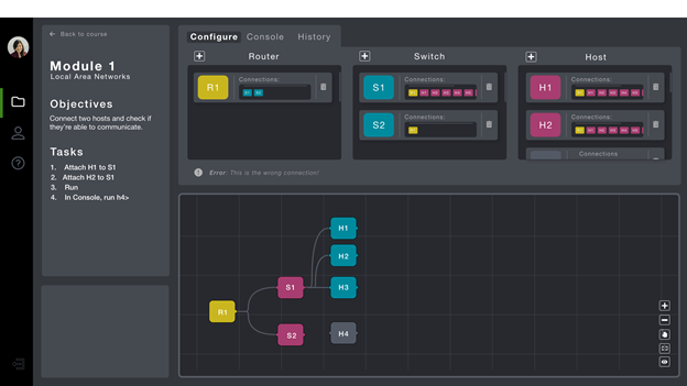
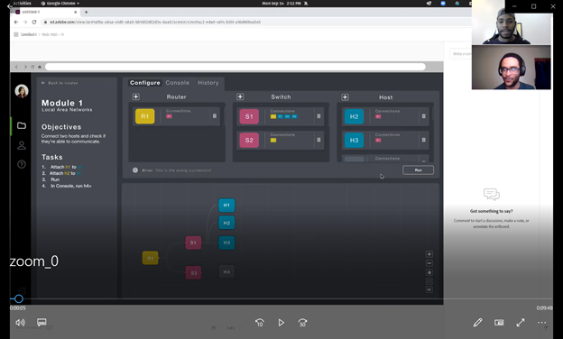
We then had users navigate to our emulator demo where they were asked to complete a series of tasks to evaluate the functionality of the configuration tab, information panel, and image panel tools.
The geographic dispersion of our participants, combined with the restrictions caused by the COVID-19 pandemic, called for moderated studies conducted via Zoom. With the participants’ consent, we recorded each session so that we could focus on observation rather than note-taking. We were able to monitor facial expressions and body language while listening to participants describe their decision-making process. While working through each task participants gave initial reactions, made suggestions, and voiced frustrations. We were able to capture genuine responses to our interface this way.
Outcomes
Our goal was to identify any and all pain points within the navigation, microcopy, and feature functionality and to collect empirical data and evidence through observation. Success was measured based on two simple criteria:
1. Whether or not participants were able to complete tasks that satisfy the stated criteria.
2. Whether or not participants asked for additional information (i.e. if they asked for something already on the
page, that was not considered a success).
We asked our participants to think aloud while they completed about 20 tasks. The tasks could be as simple as describing the relationship between specified elements or as complex as demonstrating how to connect two components within the emulator. For example, we asked each participant to add and delete a component. While all participants were able to add components without hesitation, the deleting aspect caused confusion. According to the majority of their initial actions, participants tried to delete components by first clicking the trash icon then completely dragging the component outside of its boundary. Neither of these actions was correct, which indicates a design error on our behalf.
After conducting several testing sessions we concluded that 60% of participants could successfully complete each task without moderator intervention. Although our sample size was rather small, we were able to identify several consistent pain points that will influence the direction of our next iteration. For instance, participants were consistently confused in regard to splash screen navigation and experienced difficulty deleting components within the configure tab. Over the next few months, we will work to create actionable steps to implement these invaluable insights regarding the usability of our product.
The Author

https://www.linkedin.com/in/cecilgreen/
Cecil Green is a life learner with a passion for human-centered design, Cecil is an aspiring UX Designer in Brooklyn with professional experience at top architectural firms and startups. He enjoys learning software, creating illustrations, and writing music.


